How to Read Stockcharts
How to Read Stockcharts: Develop Market Vision
Everybody knows an investor who seems to have “20-20 Market Vision”. They appear to be able to spot market trends long before the crowd. They buy at or near the bottom, sell at or near the top, and schedule vacations for the long, boring middle. How exactly does someone do it?
It’s tempting to feel that such investors have “inside information” but this is rarely true. Besides, the “20-20 Market Vision” investors we know don’t necessarily trade in corporate takeover targets. In fact, they largely ignore market fads and front-page news. What then is the secret of their success? In a word, vision.
Your vision is a remarkable skill. No computer can yet match the human eye and brain in vision or visual pattern recognition. You can recognize friends you haven’t seen in decades, even though they may have changed over the years. You can recognize landmarks while driving, scarcely putting your conscious mind in gear at all. Your vision allows your brain to receive and interpret “data” almost effortlessly. What might take a computerized visual system thousands of data points and millions of calculations “to see,” you can see in a glance. This is what makes your vision so valuable.
How does this apply to the stock market? Quite simply that every fact about the physical, economic, and financial world can, in some way, be reduced to a mark on a stockchart. Thousands of facts, therefore, can be placed on a single stockchart, and the results are displayed as a picture. In turn, this picture – composed only of dots and lines – takes on a life of its own. You can look at a stockchart, not only for the individual items of data it contains, but more importantly for the patterns those data points create. One of the real values of stockcharting is that more often than not, the patterns created by the data are much more valuable than the individual data itself. Patterns can reveal trends and relations long before isolated facts give you a clue.
This “How to Read Stockcharts” section will give you instruction and experiences, seeing important patterns and interpreting the situations portrayed by SRC stockcharts. Will the section make you into an ideal “20-20 vision” investor who never missed a top or a bottom? Maybe, maybe not. But there’s no question about it: the most successful investors are those who know the patterns and rhythms of the market, and can translate their knowledge into action. Whether or not the use of stockcharts can correct your market vision to 20-20 is an open question, but you can certainly sharpen your sights.
As you read, you will encounter stockchart examples. Look at them with some care. You’ll find that practice improves the connection between your eye and your investing mind. As you refer to the stockcharts, make sure you understand the symbols and notations on them. Learn the patterns while you study so that you will recognize them when they appear in the market. Stockcharts can be vital tools for all investors. Their skillful use however, requires much practice, and a great deal of judgment. This paper will make it easier for you to become familiar with these tools. You’ll find that they can pay off. Many people tend to think that someone who read stockcharts in his investment decisions must be a technician. A technician is often defined as someone who studies the phenomenon internal to the market – such as the patterns of price movement – in an attempt to forecast the future movement of the market as a whole, or of individual stocks.
Actually, the fundamentalist (briefly defined as one who bases his investment analysis and decisions primarily on basic factors, such as economic condition, supply and demand, labor, products, earnings and dividends) has just as much use for stockcharts. The pictures they show and the amount of information they provide help to make the task of investment selection much easier. Our advice is don’t pay attention to these labels, but learn to use and profit from stockcharts.
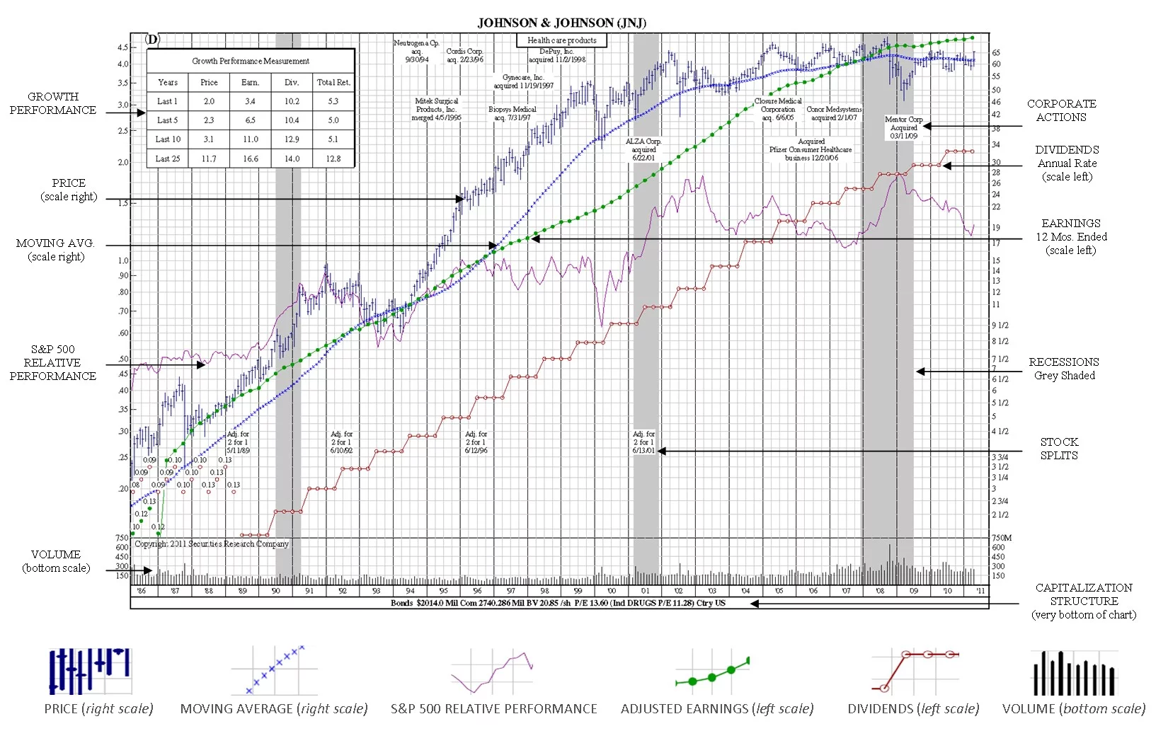
Before we explore the use of individual stockcharts, let’s discuss the features that we believe you will find of most value in helping you make valid investment decisions, using Johnson & Johnson (JNJ) as an example.
Stockchart Legend
How to Read Stockcharts: Semi-logarithmic Scales
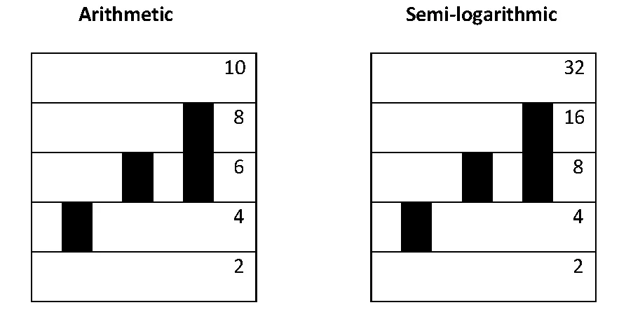
There are two kind of price scales used on stockcharts: arithmetic and semi-logarithmic (ratio). Arithmetic scales are easy – the stockchart grid is divided equally and each space is a fixed amount: a fraction of a point, one point, two points, five points. Semi-log scales have variable size spaces, each of which (whether a fraction, one two or more points) is sized in proportion to the price at each level.
You will notice that SRC stockcharts use the semi-logarithmic or ratio scale. The great advantage of such as scale is that every movement on a stockchart is in exact proportion to every other movement. This makes it possible to compare one company with another company because of the uniform ratio scale. That is impossible to do with arithmetic scales. To illustrate: if a stock moves from 2 to 4, it has appreciated two points or 100%. It it rises another two points from 4 to 6, the gain is only 50%. To gain another 100%, it would have to move from 4 to 8.
Even though the number of dollars or points may be greater at higher levels, the principle remains the same – the stock must move from 20 to 40 or from 200 to 400 to achieve a doubling, or 100% rise. This logarithmic scale is formulated so that any move of 100% (or any other percent) uses the same vertical linear distance on the stockchart, regardless of price level where it might occur.
The arithmetic scale stockchart, does not work that way. A move on an arithmetic scale from 2 to 4 looks exactly the same on such stockcharts as a jump from 4 to 6, or even an edging up from 98 to 100. Obviously, a move of two points has much greater significance when a stock is selling at 2 than when it is selling at 8, but the arithmetic scale conceals this. When using an arithmetic scale rather than a semi-logarithmic scale, the extent of a price movement, large or small, is easily hidden, and comparisons of one stock with another on such a stockchart are difficult if not impossible to make – and may even be deceptive.
How to Read Stockcharts: Key Terms
Relative Performance. The SRC relative performance is used to graphically depict in an easy-to-read manner a stock’s performance relative to the widely used S&P 500, and is read from the right scale. It shows how a stock is doing not in absolute terms, but how it is performing relative to the stock market as a whole as represented by the S&P 500. Thus, if a stock is doing better than the S&P 500 – its relative performance will go up. In fact, a stock could be declining – but at a slower rate than the market – and the relative performance line would be rising. If a stock is performing worse than the S&P 500 – either going up slower or declining fast, the relative performance line will head downward. Similarly if the stock performs about the same as the S&P 500, the relative performance will be horizontal.
Moving Average. One way of tuning out short-term gyrations from the stockchart of a stock’s price is the use a Moving Average which is read from the right scale. SRC uses different moving averages depending on the amount of time covered by stockchart. For example, with SRC’s 12-year stockcharts, we use a 48-month moving average which is the average of the previous 48 months closing prices. Each month this average is extended, it measures a different time period, as earlier months are dropped off and the latest month’s price is averaged in. This average is an essentially conservative measure, whose effect is to “damp out” wild price swings, seasonal variations, and other factors. Keep in mind, however, the it tends to diminish the effect of anything that happens quickly, no matter how important it might be.
One technical theory holds that the time to buy stock is when the stock price is above the moving average, dips towards it, but does not break through it, and then starts up again. In other words, if the moving average acts like a support level, watch carefully, it could be a buy signal.
Earnings Per Share. Earnings on SRC’s stockcharts are adjusted for extraordinary items, such as sale or divestiture of real estate holdings or other effects on earnings which don’t pertain to the company’s core business. The exclusion of one-time events from earnings gives you the clearest picture of earnings performance – which is unique to SRC. Earnings on SRC stockchart are read from the left scale.
With SRC stockcharts, price and earnings are set by a ratio of 15:1. This means if price and earnings line meet, the P/E ratio is 15. If the earnings line is above the price line, then earnings is less than 15:1. If the earnings line is below the price line, then the earnings are greater than 15:1. Coincidently, if price and earnings are consistently increasing at the same rate the overall rate of growth can be easily defined at 15%. By consistently showing all of SRC’s stockcharts this way, you can easily and efficiently compare literally hundreds of stockcharts for price and earnings growth.
Earnings averages vary by industry – price/earnings ratios (P/E) which may be 10: 1 for one industry and may be higher or lower for another – so it’s important to understand what the P/E ratio is for the industry the stock belongs to.
One technical theory holds that depending on the industry and company, earnings would fall to meet some future price or the price may rise to meet future earnings potential.
Dividends. Dividend payments are displayed directly on SRC’s stockcharts. Dividend payments, like earnings, are read from the left scale and are plotted on an annual basis. Dividends above or below the stockcharts, as well as specials, extras, irregular payments are placed on labels.
Dividend growth can give the stockchart user a very good idea of how the company is performing. Are dividends growing? Is there consistency to the dividend payments? How does dividend growth compare to price and earnings growth?
Given the recent turbulence in the stock market, as well as more investors nearing retirement years, the dividend a stock produces can significantly increase the overall return for a stock.
Stock Splits. All stock splits are noted with a label on the stockchart – and all SRC stockcharts have been fully adjusted for stock splits.
Take, for example, a company with 100 shares of stock priced at $50 per share. The market capitalization is 100 × $50, or $5000. The company splits its stock 2-for-1. There are now 200 shares of stock and each shareholder holds twice as many shares. The price of each share is adjusted to $25. The market capitalization is 200 × $25 = $5000, the same as before the split.
Ratios of 2-for-1, 3-for-1, and 3-for-2 splits are the most common, but any ratio is possible. Splits of 4-for-3, 5-for-2, and 5-for-4 are used, though less frequently. Investors will sometimes receive cash payments in lieu of fractional shares.
It is often claimed that stock splits, in and of themselves, lead to higher stock prices; research, however, does not bear this out. What is true is that stock splits are usually initiated after a large run up in share price. Momentum investing would suggest that such a trend would continue regardless of the stock split. In any case, stock splits do increase the liquidity of a stock; there are more buyers and sellers for 10 shares at $10 than 1 share at $100.
Other effects could be psychological. If many investors believe that a stock split will result in an increased share price and purchase the stock the share price will tend to increase. Others contend that the management of a company, by initiating a stock split, is implicitly signaling its confidence in the future prospects of the company.
In a market where there is a high minimum number of shares, or a penalty for trading in so-called odd lots (a non multiple of some arbitrary number of shares), a reduced share price may attract more attention from small investors. Small investors such as these, however, will have negligible impact on the overall price.
Volume. Each SRC stockchart gives volume information in the panel at the bottom of the stockchart. Notice that the vertical scale on this stockchart is not logarithmic, but arithmetic. Volume is most often represented by height. Volume is crucial to interpreting price data. An extremely high or low price reached on very light volume may indicate the opinion of only small number of investors: possibly not good data. However, any price supported by massive buying or selling volume, conversely, can usually be taken seriously. Like heavy turnout in a presidential election, heavy volume is a mandate, and likely to indicate wide acceptance of the valuation of a stock.
Growth Performance Measurement. The growth performance of a company is provided in a block that appears in the upper left corner of each long-term company stockchart. The percent gain or loss for price, earnings and dividends is given for specific time periods as indicated by the number of years shown. This feature gives the investor an excellent snapshot of the company’s performance over time – without having to use other reference sources.
An additional feature is the bold circled P,E, or D that may appear above the block. This highlights price “P”, earnings “E”, or dividend “D” when any of the three meet or exceed pre-set parameters for: price growth greater than 20%, earnings growth greater than 15%, and dividend growth greater than 10% for a specified for that stockchart type.
Corporate Actions. Important single events in a company’s history are noted on SRC Stockcharts. These events could be an acquisition, merger or divestiture of another company or division, and can explain why there is a change in the price, earnings or dividend payments at a certain period in time.
Capitalization Data. Capitalization data is included at the bottom of each stockchart and includes: Bonds • Shares Outstanding • Section Value/share • Industry • Company P/E Ratio • Country
How to Read Stockcharts: Getting the Short-Term View
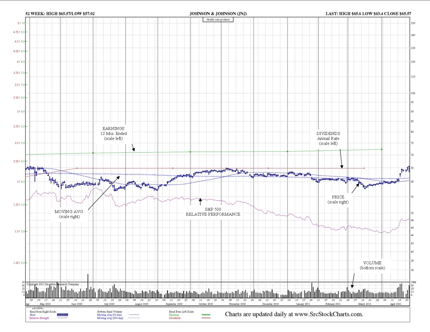
SRC has two stockcharts giving you the short-term view. The 52-Week Stockcharts are plotted on a daily basis, and the 21-Month Stockcharts, are plotted weekly.
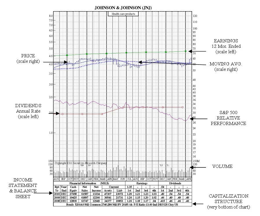
The One Year or 52-Week Stockcharts. SRC’s shortest term stockchart provides daily prices, including the most recent high, low and closing prices – as well as the high and low prices for the past 52 weeks. Each 52-Week Stockchart is on its own full-size, 8.5” x 11” page, and has the relative performance, earnings adjusted for extraordinary items, as well as both the 50-day and 200-day moving averages.
One Year or 52-Week Stockchart
The 21-Month Stockcharts. SRC’s 21-Month Stockcharts are useful to both the fundamental and technical investor alike. In addition to all of SRC’s standard plottings, the 21-Month Stockcharts also feature both the 13-week and 39-week moving averages. In addition, the 21-Month Stockcharts also feature key income statement and balance sheet metrics for the past three years including:
- Cash Equivalents • Net Sales • Net Income • Current Assets • Current Liabilities • Quarterly Earnings • Quarterly Dividends
Capitalization data is included at the bottom of each stockchart and includes: Bonds • Shares Outstanding • Section Value/share • Industry • Company P/E Ratio • Country
21-Month Stockchart
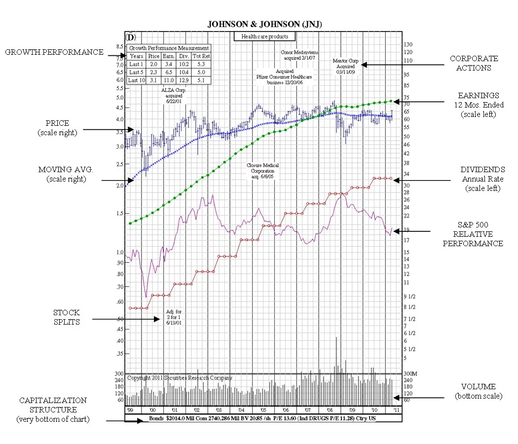
How to Read Stockcharts: Mid-Term View 12-Year Charts
The SRC 12-Year Stockcharts provide the investor with longer look at the performance of a stock – it’s this longer view that begins to show performance trends over time.
12-Year Stockchart
How to Read Stockcharts: The 25-Year, 35-Year and 50-Year Views
It usually pays to know as much as possible about the companies you invest in. But there’s a difference between current data and ancient history. How far back does it pay to look at a company’s performance, and how should the information be interpreted?
SRC publishes three compilations of long-term stockcharts: 25-Year Stockcharts, 35-Year Stockcharts, and 50-Year Stockcharts.
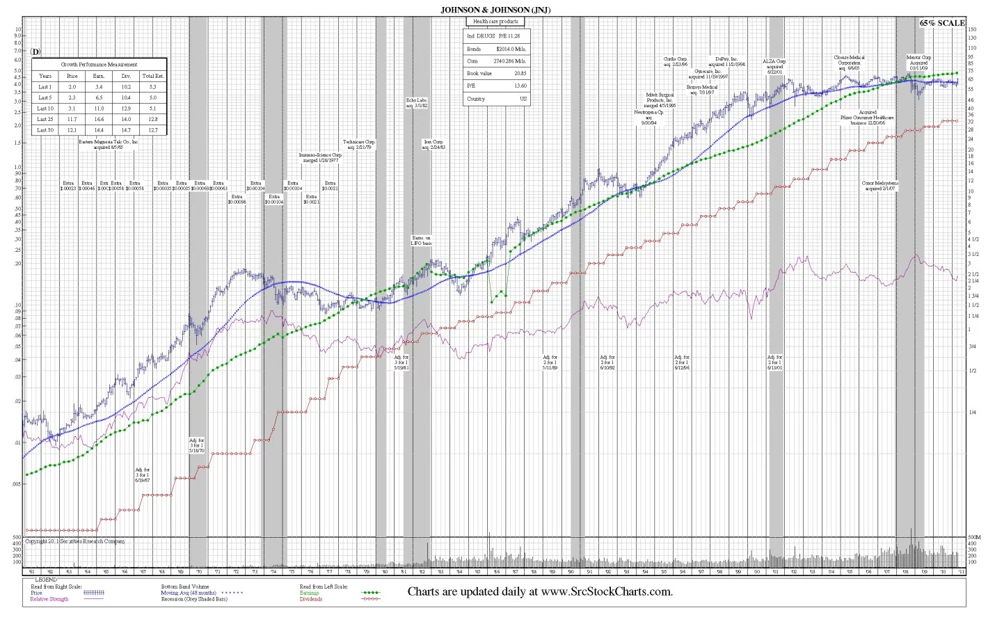
All of SRC’s long-term stockcharts contain one additional feature that SRC’s shorter-term stockcharts don’t have. SRC’s long-term stockcharts display recessionary periods that are grey-shaded, so that you can clearly see how the company fared during recessions as well as expansion periods.
Why is this important? When you begin to examine the long-term picture of a company, you will see that history often repeats itself, with stock prices and earnings following similar patterns during recessions – as well as how the stock performs when the economic recovery begins. These stockcharts, with their thousands of plotting points, each represent a vast reserve of factual information for the investor and analyst who wants to follow earnings, dividends, and price patterns, plus the relationship of each to the other. In addition, each stockchart quickly shows where a stock stands today in relation to various points in the past. This long-term record permits the study of various trends and formations, especially those which may not be evident in short term stockcharts.
The long-term data are also a powerful lesson about the cyclical nature of the American business, and the inter-dependence of our entire economy. No company, not even the strongest, is completely protected against recession. No company can fail to be buoyed by a rising tide, unless it has significant underlying problems. Long-term stockcharts show the market in its realism, with fads and fashion ironed out.
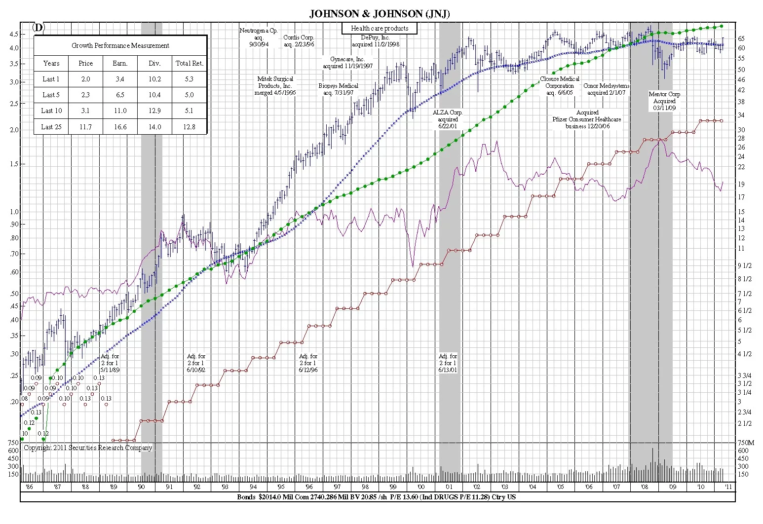
Below you will find the 25-year, 35-year and 50-year stockcharts for Johnson & Johnson. Notice the consistency in earnings and dividend performance over these time periods; how the stock price fared during the recession and expansion periods; how the relative performance to the S&P dipped at the start of each expansion period, and then recovered. It’s these valuable pieces of information that can shed light on how a company may fare during similar economic circumstances in the future.
25-Year Stockchart
35-Year Stockchart
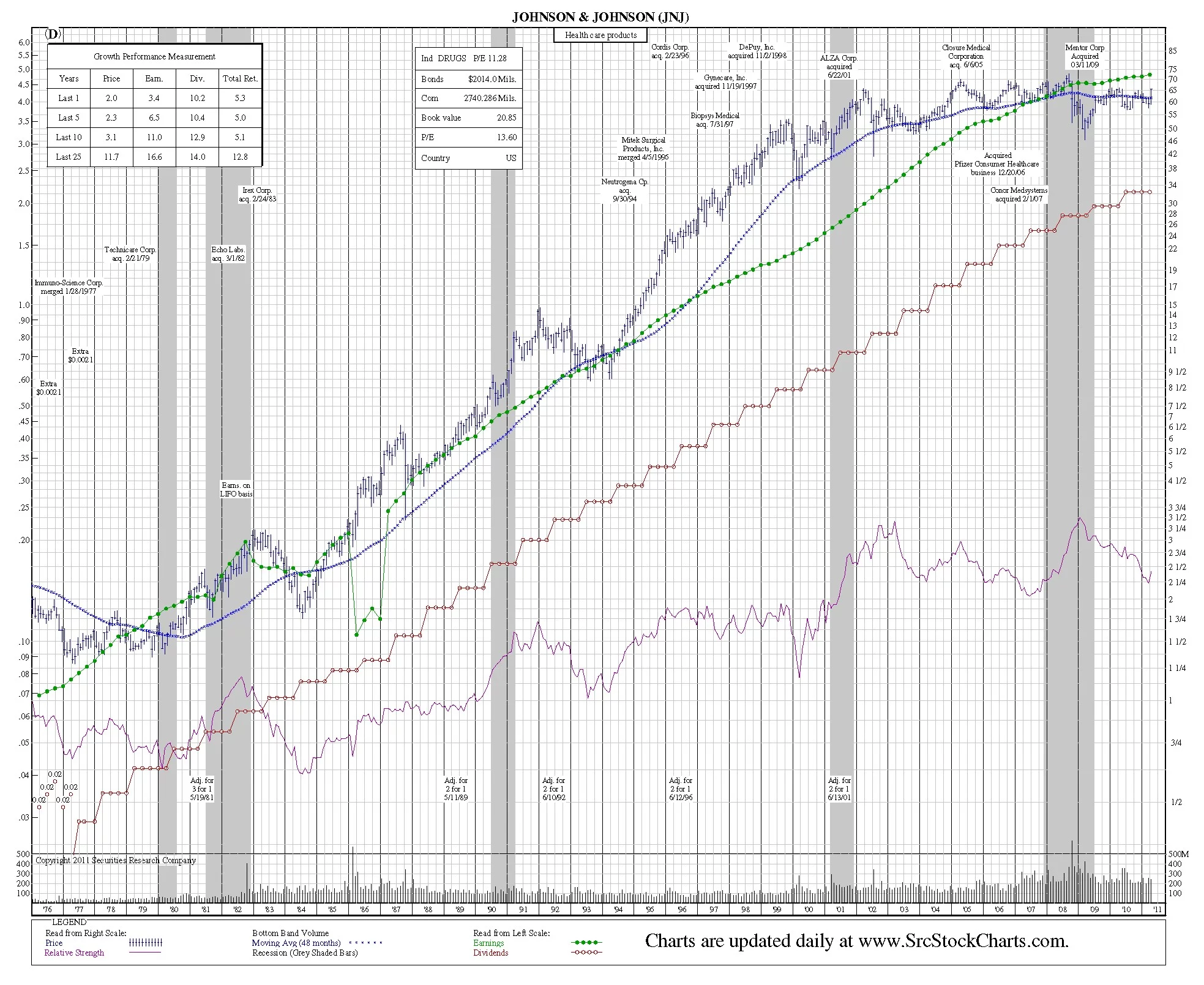
50-Year Stockchart
